For several decades, Fritz Torres has worked at the intersection of design and visual communication, navigating various creative fields. His work has been instrumental in shaping a graphic identity rooted in border culture and influential projects such as Nortec. The artist has developed editorial projects, served as art director for festivals and television, and engaged in international collaborations with artists and brands, always maintaining a constant dialogue between Tijuana and other cultural contexts. We spoke with the border artist.
What is your educational background?
I’m an architect. When Ibero opened, I switched to the graphic design program, but that only lasted a couple of semesters. Then I went “over there” for a while—a short stint in New York—and I was kind of wandering around, trying to capture things here and there. And that’s it; I’ve always ended up doing a lot of graphic design work.
Before the albums, you did graphic design for magazines…
Then I went back to Tijuana—well, no, I never left; I always worked from Tijuana—but I refocused my client base on local clients. Around that time, we started putting out a magazine that was inspired by *El Sueño de la Gallina*, which was a kind of large-format fanzine, almost tabloid-sized, printed on high-quality paper and very well produced, where we tried to showcase the city’s creative graphic design scene.
The name came from the fact that it was the only bird with wings that couldn’t fly; so the idea was to create a forum for expression where people who had something to say or contribute could, metaphorically speaking, let their creativity take flight. We put out two issues, and for the third issue we called it Chat 3 or Chachacha. When we held the launch event for issue number 3, the entire local scene came together: musicians, designers—everyone was there. It was a very interesting gathering.
Does the city have a visual identity?
Well, that’s a good question, because this city has always been a bit of an improvised place—there weren’t any established networks related to this here. However, across the border in San Diego, we had universities and colleges, so a lot of people were getting trained there. But here, what we really had in abundance were visual artists.

There was a group of internationally renowned artists who were doing certain things in the 1970s and 1980s or so. But when the graphic design program at the University of Nueva América was launched in the 1980s, the closest thing available here was an architecture program at the Tecnológico.
So graphic design came along—if not to completely change the game, then certainly to open our eyes to new perspectives. You’d been studying things like calculus, and suddenly a university opened up where you could study photography, illustration, this and that. So there was a boom in graphic design degrees: everyone wanted to become a designer.
What elements of the border influenced the visual identity?
There are things that define us as a unique place, with certain visual and graphic characteristics. For example, when you cross the border and head from here to San Diego, you start seeing FBI wanted posters, reward posters, people selling this or that, skull-shaped saints… a whole bunch of things that make you say: this is so typical of this place and you hardly ever see it anywhere else.
There were also northern-style bands with electric guitars playing on street corners, or tubas doubling as bass in music where that wasn’t previously common. Those kinds of elements—the musicians themselves—were a very interesting and important visual feature.
How did the curatorial approach influence the visual design?
Pepe basically had very strict curatorial standards: not just anything. You can’t just put together a rock band with an accordion and call it norteño; it has to stem from the essence—the rhythmic and musical essence—it must stem from norteño. So, in our graphic design, we did the same thing: the original concept had to stem from the local culture and from what we experience here on the border.
Was there creative freedom in Nortec’s designs?
We had creative freedom as long as we felt that something wasn’t too cliché or derivative. We were free to experiment with typography and imagery, as long as we stayed true to that spirit—which was kind of the same as with music.
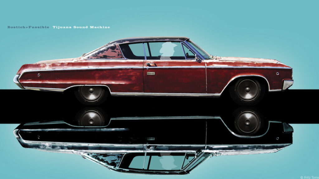
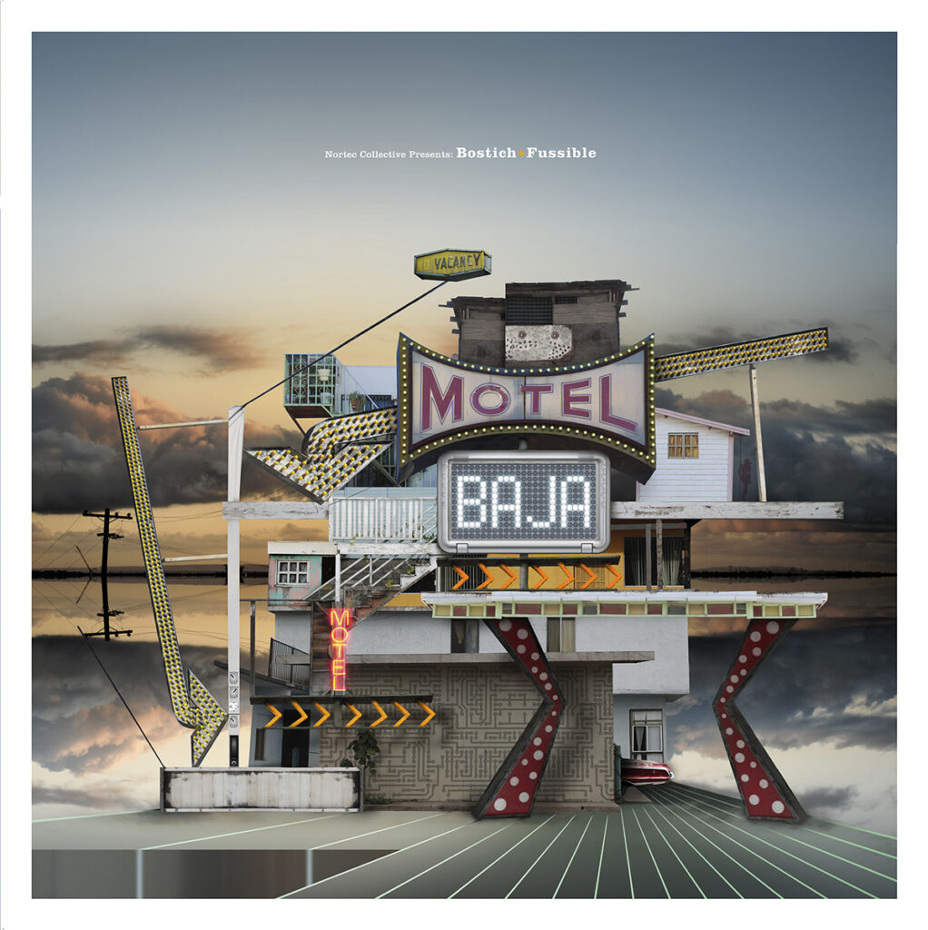
“In fact, the visual theme of Nortec’s first album was based on musicians from the north, and that’s where this whole aesthetic began to take shape, which was later brought together in the book *Paso del Nortec: This is Tijuana*.” ”– Fritz Torres
What is the status of the book and exhibition *Tijuana Covers*?
A couple of years ago, we finished that project on the history of music, a journey we took from 1960 to 2020: 60 years of graphic art representing Tijuana’s cultural legacy.
The city has always been a vibrant place, known for its close ties to music, largely because of its location on the border. Originally, we wanted to create a book showcasing the album covers of Tijuana’s most prominent artists, but it eventually evolved into a historical document—a chronicle of Tijuana’s graphic and musical culture spanning 60 years. We reached the ’80s, the changes brought by technology, the ’90s, the 2000s, and how electronic music began to become part of the scene. Tijuana was the first place in Mexico where an electronic music album was recorded, with the group Artefacto, around 1987.
When do you plan to open the exhibition?
We wrapped that up in 2022, and the information-gathering process was put on hold until 2020. So right now, we’re planning an exhibition—a major exhibition featuring all the cover art and the original artwork that led to those covers. We have a very specific vision for it because we’re in the process of gathering material to see what else we can find and what we can add to the project, which was already quite extensive. We plan to present the exhibition in October or November.
Will they be taking it to different cities, or will it just be in Tijuana?
For now, it’s only in Tijuana. We originally thought that if it goes well in Tijuana, we might expand this cover concept to other places.
The truth is that the project has become a historical compilation, so we don’t want to compromise on that front. We have received a couple of proposals to expand it. Tijuana Covers is the title of the book, and it would also be the title of the exhibition.
What does the future hold for vinyl records in the digital age?
Gosh, that’s a tough question to answer, because what we’ve actually found is that, for example, in the compilation of album covers we put together—both for the book and for the exhibition—80% of music projects are released in digital format: they’re on social media, they circulate via QR codes or some other means, and they very rarely get printed or produced as physical items that include covers.
What role does the resurgence of vinyl play today?
On the other hand, there’s the resurgence of vinyl, which has become a collector’s item. Records are produced in limited runs, but anyone who owns one is a collector, so it’s no longer so much a business venture as it is part of the musical legacy the city is leaving behind.
But there are also labels that release cassettes as exclusive items…
Yes, there’s a local record label that focuses on producing cassettes, so they’re all about physical formats. These efforts help maintain this almost collector’s-like perspective, where the visual presentation of the music is a physical object.
How have the production and design of these pieces changed?
That gives us some breathing room, because now that production is done more carefully and in smaller runs, more attention is paid to the graphic design, the layout, and even the physical production: more effort goes into the paper, and the vinyl features colors or patterns. It used to be an industrial process, and now it’s more of a custom-made piece. So things that were once unthinkable, like a colored vinyl, can now be produced without any problem. The technical limitations have been overcome, and it’s economically viable; there are few companies, but they’re very well-equipped and offer competitive prices.
Discover more interviews with Latin American designers in AW Magazine.