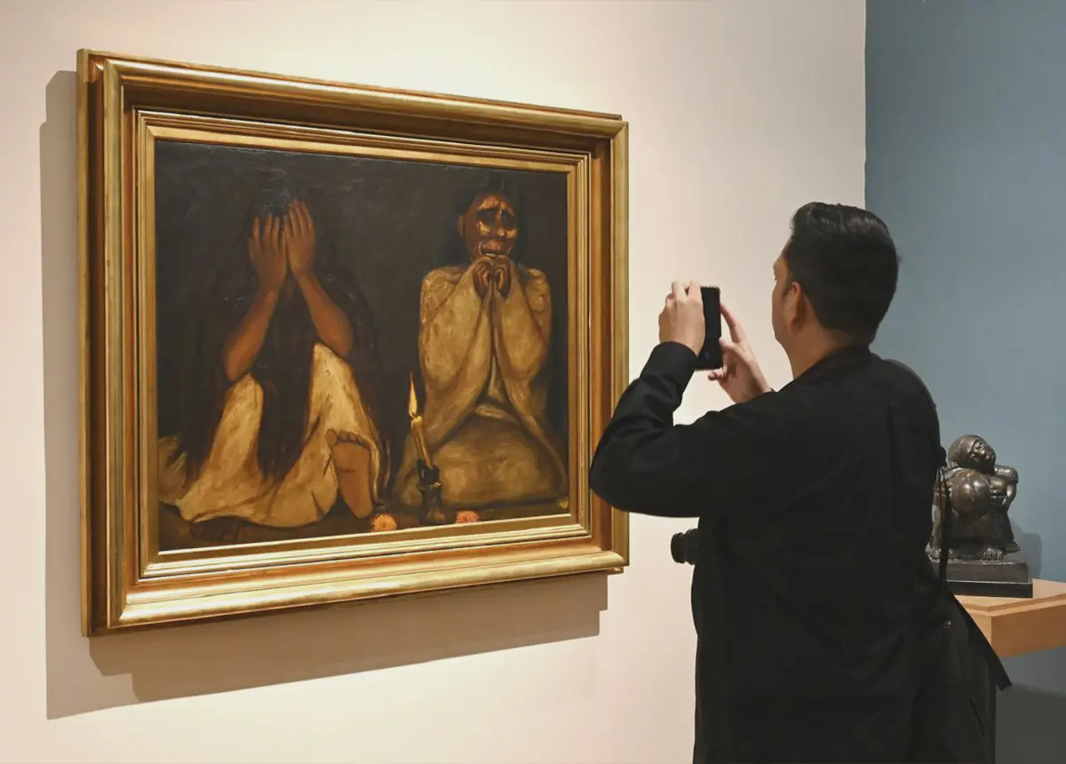
Whether for their design, what they symbolize, or the artistry and intention behind them, these are five iconic album covers of Latin American rock.
As Los Prisioneros —the Chilean rock band that, by the way, spoiler alert, is on this list—would say: “Elvis, shake in your grave” in their song “We Are South American Rockers.”
These Spanish-language albums—without the need for spectacle or Latin or traditional clichés during the Super Bowl halftime show (like the one that just took place)—showcased local identity and resilience.
“Clics Modernos” by Charly García (1983): How to Become Modern Overnight
The album that turned Charly García into the very thing he had so vehemently rejected in earlier songs like “Raros peinados nuevos” (in which he ironically referred to modern music as something rather fleeting and superficial) stood out, in addition to songs like “No soy un extraño” and “Ojos de videotape,” by an iconic cover.
It showed Charly posing in New York at the corner of Walker Street and Cortlandt Alley, next to a piece of graffiti by the Canadian street artist based in Manhattan, Richard Hambleton.
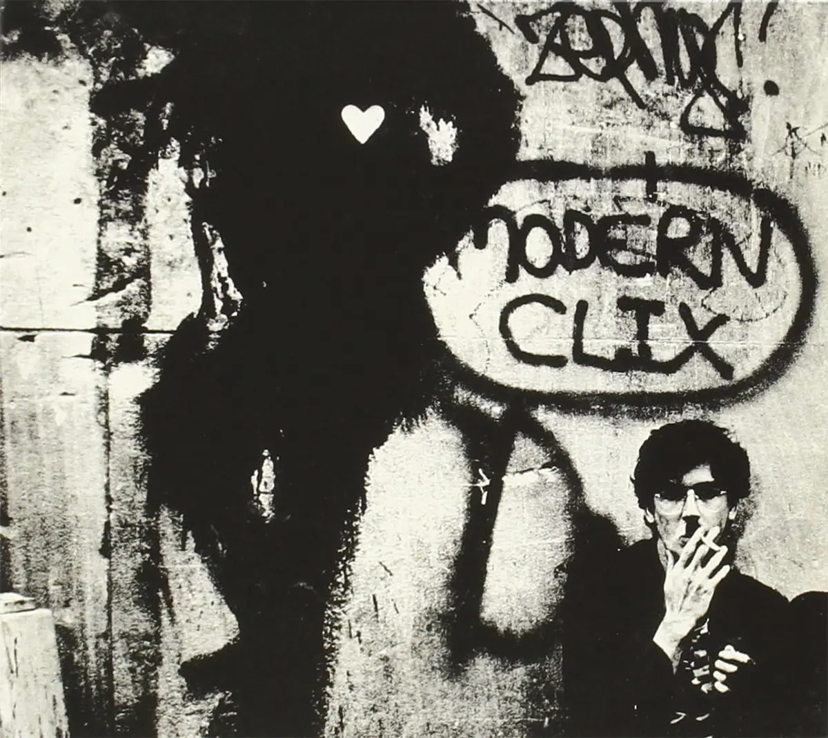
The cover art captures the modernity of post-Falklands Argentine rock and reflects the avant-garde spirit of an album filled with samplers—a rarity at the time in the South American rock tradition—and drum machines. All of this is interwoven with tango and a distinctive new wave sound.
In November 2023, the street where the photo was taken was officially renamed Charly García Corner. The renaming took place to commemorate the 40th anniversary of the album’s release and in recognition of its cultural influence.
“Dynamo” by Soda Stereo (1992): A New Decade and a New Look
Gustavo Cerati and Zeta Bosio—singer/guitarist and bassist, respectively, of Soda Stereo—came from the world of advertising. As a result, it was only natural that the visuals and artwork for their albums would strive for the same level of conceptual rigor as their songs. In Dynamo, the band drew closer to the shoegaze and dream-pop sound (lots of ethereal guitars and walls of sound) of their British contemporaries like My Bloody Valentine and, above all, the Scottish band Cocteau Twins.
It was the ’90s, and their dark sound—once overshadowed by The Cure and Echo and the Bunnymen—was long gone, as was their recent phase of acid rock with Animal Song, their previous album. The artwork for Dynamo was fully in line with albums like Heaven or Las Vegas by the aforementioned Cocteau Twins. The dreamy colors and textures of the album clearly reference that cover, released two years earlier.

Argentine graphic artist Alejandro Ros—whois part of the first generation of graduates from his country’s graphic design program—served as art director and was responsible for the album’s visual concept. Meanwhile, Gaby Herbstein handled the interior photos. Without a doubt, it is one of their most elegant album covers, which also encapsulates an entire era.
“La canción de Juan Perro” by Radio Futura (1986): Embracing Latin culture and Juan Rulfo
Having long since moved away from their new wave and Madrid movida roots—which had led them to sing glam anthems like “Enamorado de la moda juvenil”— and now more devoted to fusing rock with Latin sounds, Radio Futura chose to adorn the cover of one of their mid-’80s masterpieces in that style. The artwork, with an image somewhere between rustic and futuristic, paid tribute to the imagery of the Mexican ghost town of Pedro Páramo, the novel by Juan Rulfo.

The cover, designed by the then-emerging Spanish painter and architect Juan Navarro Baldeweg —who would later receive the National Prize for Plastic Arts and the Gold Medal for Merit in Fine Arts, among other honors—is taken from a piece titled “El canto del gallo.” In this track, one of the songs written by Auserón included on the album, the musician sings without denying his literary roots: “There is abundant water in this wasteland, and color has returned to its face.”
“Corazones” by Los Prisioneros (1990): Symbols and Love Songs
Designed by artist Vicente Vargas, the album cover—which steered the Chilean band toward a more down-to-earth and less political direction—features the torso of Jorge González, the band’s singer-songwriter, wearing a bloodstained white shirt.
The ink mark is deliberately placed on the opposite side of the heart. The idea: to symbolize an unattainable love, just as happened in real life with the love triangle that unfolded within the group between González, the wife of his former bandmate Claudio Narea, and Narea himself.

Although the image was reversed on the 1995 reissues, the symbolic power of a broken heart, paired with songs as romantic as they are obsessive—such as “Estrechez de corazón” or “Tren al sur”—remains one of the most iconic moments in rock—in this case, rock infused with synth-pop—sung in Spanish. Without a doubt, it is a highly ad hoc cover, laden with symbolism.
“Re” by Café Tacvba (1994): Mexico, cultural fusion, and cycles
It is often said that this double album by the Mexican band is the Latin American equivalent of The Beatles’ by The Beatles. And coming from Argentina—where there’s even a church dedicated to Maradona (the one in Mexico closed last year due to low attendance, and that’s a fact)—and where people tend to be quite proud of their local identity, this makes it an even greater compliment. Personally, I find the claim a bit of an exaggeration, but the truth is that both the eclectic music and the artwork surrounding it are indeed a sign of a desire to take things to the next level.
The cover, designed by the band’s lead singer, Rubén Albarrán, and conceptual artist and activist Sergio Toporek, features a pre-Hispanic snail that symbolizes the album’s cyclical vision, cultural fusion, and a journey toward local identity. This idea was presented in a more playful and much more entertaining way than Octavio Paz intended to convey in The Labyrinth of Solitude.
It’s no coincidence that, as a kind of declaration of independence, one of the songs (“The End of Childhood”) goes (or rather shouts): “We’ll be able to dance on our own.”

The album artwork, which in its cassette version from the 1990s came in a small cardboard box, was accompanied by various graphic elements. Viewed from a distance, this design stands out as a genuine effort to present an album in which sounds of bolero, industrial rock, mambo, disco, funk, and electro-pop unfolded as a cohesive whole.
Without a doubt, these albums left their mark not only because of their musical content, but also because of those appearances that can sometimes be deceiving—yet here, they were truly aligned with a single concept.
To keep exploring this thread, visit cultural perspectives from Latin America.