The 2026 FIFA World Cup will be held in various cities across the United States, Canada, and Mexico. This is the first time that three countries will co-host the event. Mexico will host the world’s biggest soccer tournament for the third time.
In addition to the matches, there’s something else that always generates excitement: the official posters and logos for the tournaments, which are almost always created by renowned artists and designers.
AW Magazine takes a look at the posters for the World Cups held in Spanish-speaking countries.
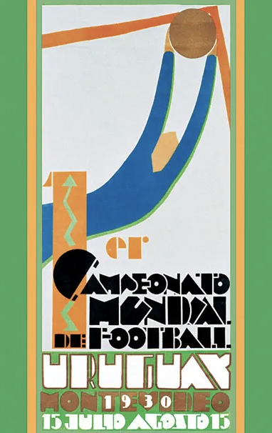
Uruguay 1930: The First World Cup and Planism
The 1930 World Cup in Uruguay was the first in history. It brought together invited teams from the Americas and Europe. The tournament marked the beginning of this global tradition. The champion of the tournament was Uruguay itself.
Guillermo Laborde, a key figure in Planism, designed the poster. This aesthetic and pictorial movement emphasized defined blocks of color and highly minimalist compositions. The poster depicts a goalkeeper frozen in mid-action. The poster’s typography and other elements evoke the Art Deco aesthetic.
This poster served as the visual identity for the first tournament. The human form, rendered in a geometric and monumental style, symbolized confidence in the modern future.
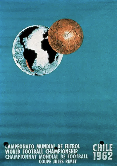
Chile 1962: The Space Race
The 1962 FIFA World Cup in Chile brought the tournament back to South America. Chile served as the host nation. It had just suffered a devastating earthquake. The country’s motto was “Since we have nothing, we will do everything.” Brazil was the champion on this occasion.
The poster is the work of Galvarino Ponce Morel. In this piece, the design departs from the human figure. In the image, the planet Earth lies suspended in a blue void. Next to it, a ball floats nearby. This work engages with the space race and the struggle for the conquest of the Moon, waged during the Cold War.
The typeface chosen was Helvetica, which later became one of the most popular modern typefaces of the 20th century. The poster features clean lines, a clear composition, and a striking visual synthesis.
Mexico 1970: Ramírez Vázquez, Once Again
The 1970 World Cup in Mexico is remembered as one of the most celebrated tournaments. On this occasion, the event established itself as a global television spectacle. Brazil also won this competition.
The graphic identity drew on key elements from the 1968 Olympics, which were also held in this country. Designer Lance Wyman created a typeface based on parallel lines. As a result, the logo combined text and imagery.
The legendary architect Pedro Ramírez Vázquez, who designed many of the country’s iconic buildings, oversaw a comprehensive design vision. The result was a geometric landmark that remains unforgettable to local sports fans today.
The mascot was Juanito: a boy wearing the national team’s uniform and a hat emblazoned with “Mexico 70.”
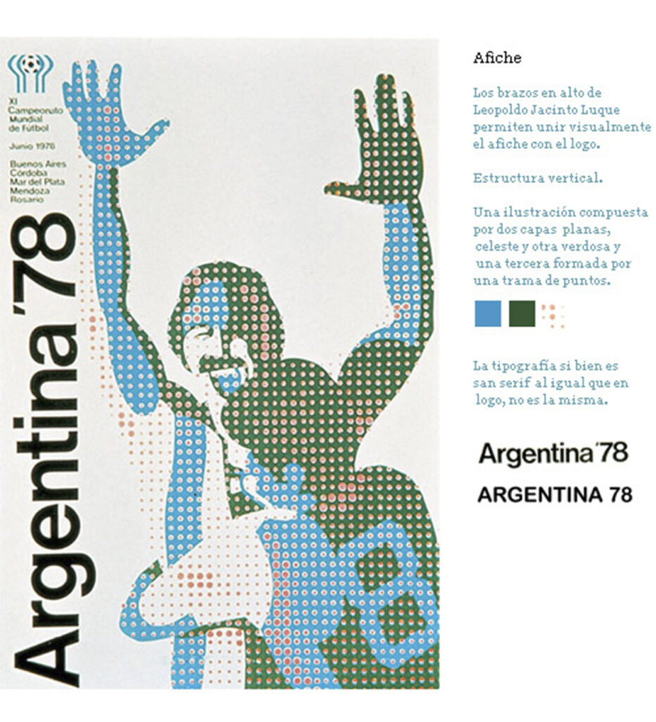
Argentina 1978: Playing Amid the Military
The 1978 World Cup was held under one of the most brutal military dictatorships in 20th-century Latin America. The country was gripped by repression, censorship, and the disappearance of any citizen suspected of subversion. Argentina itself was crowned champion of that World Cup.
Eduardo López designed the poster; it was the first one based on a manipulated photograph. Two Argentine players embrace in celebration, rendered with superimposed elements and geometric patterns in a pop art style.
The mascot was Gauchito, a boy dressed in traditional Argentine attire and the national team’s uniform. This sweet little Argentine boy lived amid a deeply painful military context.
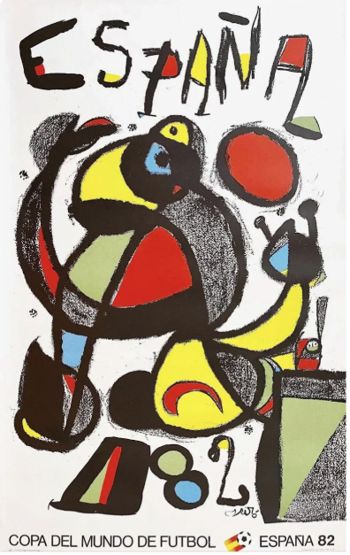
Spain 1982: The Early Years After Franco
The 1982 World Cup in Spain was the first major international event held in the country following Franco’s death. During the transition to democracy, Spain needed to forge new collective experiences. Italy won the tournament.
The iconic artist Joan Miró designed the poster. The organic shapes and primary colors created an instantly recognizable image. Red and yellow, the national colors, dominate the composition.
The mascot was Naranjito: an orange with a human face, wearing the Spanish national team’s uniform and carrying a soccer ball under his arm. The character was designed by María Dolores Salto and José María Martín Pacheco.
Mexico 1986: Annie Leibovitz
The 1986 World Cup in Mexico made it the first country to host the tournament twice. The tournament left an indelible mark on the 20th century thanks to Diego Maradona and two goals that are still celebrated and debated today.
Rubén Santiago designed the logo. He incorporated pre-Hispanic references into a minimalist composition using only a few elements.
The poster was created by Annie Leibovitz. This legendary photographer was already well known for her portraits in magazines such as *Vanity Fair* and *Rolling Stone*. It was the first entirely photographic poster and the first time a woman had designed a World Cup poster.
The mascot was Pique, a jalapeño pepper with a mustache and a hat.
Mexico 2026: The Future
The 2026 FIFA World Cup will mark a new era. Mexico will host matches for the third time in its history and will feature three official host cities: Mexico City, Guadalajara, and Monterrey.
All three were created by the young designer and artist Cuemanche. The poster featuring the capital city includes axolotls, the Angel of Independence, the Palace of Fine Arts, Chapultepec Castle, and other quintessentially Mexico City elements. The host stadium appears in the center.
The illustration is filled with urban and cultural symbols. Sports coexist with organ grinders, wrestlers, and a spinning top made of al pastor-style meat.
From the ball to the image
The World Cup has never been just a sporting event. Each edition reflects the political and cultural climate of its host country. Therefore, each poster is a snapshot of its time.
Perhaps that’s why, even for those who don’t really follow the games, the World Cup’s graphic design always gives people something to talk about.
Meet other graphic designers in AW Magazine.
